From One Clinical Research App to a Scalable Open-Sourced Research Platform
As Principal Designer at Sage Bionetworks, I led the redesign of mPower—a digital study tool for Parkinson's research—aligning participant needs with scientific goals. I translated complex requirements into intuitive interfaces and evolved the app into an open-source, scalable platform reused globally across mobile, wearable, and voice-first experiences.
Company
Sage Bionetworks
Role
Principal Designer
Timeline
12 months
Results
Increase in study completion
Daily ask adherence, for duration of study
Studies using the new design system
Problem
mPower launched at Apple’s WWDC to massive hype—tens of thousands downloaded it in days. But within a month, daily retention dropped to 5%, crippling the research. Without sustained use, scientists couldn’t collect enough data to validate digital biomarkers like tremor or voice changes.
Daily retention dropped to 5% within a month.
The result: researchers couldn't collect enough data to validate digital biomarkers like tremor.


Original mPower app interface
The original experience prioritized scientific completeness over usability. Consent was legalistic. Tasks felt like chores. And there was little payoff for participants—just a dashboard with charts they didn’t understand. Despite strong interest from scientists and partnership with Apple, Sage needed a reboot: an experience people would actually return to.
Opportunity
Instead of patching flaws, I saw a chance to reimagine the experience from the ground up—putting participants first to build trust, reduce burden, and deliver high-quality data.
The goal was to design a research platform that:
- • Engaged participants with clear, meaningful tasks
- • Worked seamlessly across phone, wearable, and voice
- • Gave scientists modular, reusable tools for future studies
Understanding the Problem
We spoke with 24 individuals living with Parkinson's, and the themes were clear: the app was confusing, the process was frustrating, and the experience felt one-sided.
Consent happened after the app was downloaded, which created an immediate barrier. Participants were thrown into long explanations without context, often stuck in loops of back-and-forth steps, unable to complete the process. One usability test participant got caught in a verification loop.

"I have 30 years of data points in my head, but I can't really do anything with them."
— Participant 3
"Don't know if anyone wants to measure their decline."
— Participant 6
"I felt silly. I didn't scroll down to get started."
— Participant during onboarding test
"I'm trying too hard. I feel like a dufus."
— Participant navigating login flow
The app's tone and interactions lacked warmth and clarity. Email verification confused many users. Instructions were missed or misunderstood. Even minor friction—like not knowing where to tap—compounded the emotional fatigue of participating in a study about decline.

Original mPower consent flow with multiple friction points
This validated a core design principle: scientific rigor and empathy are not mutually exclusive. To succeed, the product needed to feel as supportive as it was structured.
My Approach
Designing for long-term engagement in digital health meant rethinking every layer—from participant trust to platform flexibility. I anchored the redesign around four pillars:
🧠Participant Reality as a Foundation
"You're asking me to give up my data and time, and I'm not sure what I get out of it."
Participants voiced emotional and cognitive hesitation. I reframed onboarding and consent as reciprocal—not extractive—adding clearer messaging, progress cues, and tone testing across age and identity groups.
Result: 50% reduction in onboarding drop-off
🧾Rebuild Consent and Onboarding
The original flow overwhelmed people with dense legal text upfront. We broke it into plain-language summaries with progressive disclosure and inline illustrations, making expectations transparent and manageable.
Result: Higher comprehension and completion—fewer support requests, and smoother handoff into first study task
🧩Modularize the Measurement Experience
Task flow was rigid and confusing—mixing surveys, voice prompts, and motion tests into a single, unbroken timeline. Participants felt lost.
We broke tasks into named, reusable modules with clear instructions and feedback. Co-design sessions shaped naming, cadence, and end states. Each module now stands alone, making it easier to pause and return.
Result: 7x increase in study completion
🌐Extend the Platform Beyond Phones
To support Apple Watch and voice-based tasks, I partnered with engineering on a device-aware design system: theming, illustration templates, fallbacks, and platform-integrated UX for sensors.
Result: 40% of participants stayed active for 30+ days; sensor tasks accounted for the majority of completions in later phases
Solution
1. Redesigning Consent as a Relationship
Many users went through multiple steps—including downloading the app—only to discover they weren't eligible for the study. This left them frustrated and discouraged.

Original study website with complex, overwhelming consent flow
To address this, we redesigned the consent flow and built a dedicated study website that clearly communicated the study's value upfront. Participants could review requirements, understand what to expect, and complete consent directly on the site—with a quick link to download the app only after confirming eligibility. This streamlined the experience and significantly reduced onboarding friction.

Redesigned study website with streamlined, participant-friendly experience
Key enhancements included:
- • Introducing the study team up front to create a human connection
- • Using large-type, simplified language, and visual PDFs to improve comprehension
- • Providing chat, email, and phone support to reduce participant isolation
- • Building eligibility and comprehension checks into the experience to ensure informed enrollment
This consent model became a reusable pattern across later studies and set a precedent for scalable ethical UX in mobile research.

Consent overview with detailed study information

Digital signature and consent confirmation

Step-by-step onboarding process

Registration confirmation and app download link

Study requirements overview

Data privacy and security details

Phone number registration

SMS confirmation and app download
2. Scalable Design System for Modular Health Measurements
Rather than designing individual screens per study, I created a scalable design system that supported themed, reusable modules—enabling consistency across clinical research apps while maintaining flexibility for diverse populations and study types.
This modular system—designed with tremor-friendly touch targets and passive interaction modes—became the design foundation for products like BP Lab and Heart Snapshot, and was eventually integrated into Apple's ResearchKit, enabling scalable deployment of research tasks to global study teams.
💡Core Measurement Modules
This modular system underpinned multiple digital phenotyping studies, drastically reducing design and development lift for future teams. Modules—ranging from physical-activity trackers and cognitive assessments to self-report surveys—were built as self-contained UX units, co-developed with researchers to ensure scientific validity and clinical rigor.
Below are a few examples of these modules:
- Tremor tracking (e.g., hold-phone tests)
The tremor test demonstrates the modular design approach: clear step-by-step guidance, accessible instructions with visual aids, and a streamlined user experience that reduces cognitive burden while collecting clinically valid tremor data.
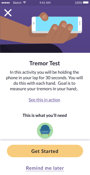
Test introduction
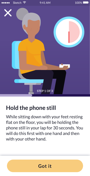
Instructions
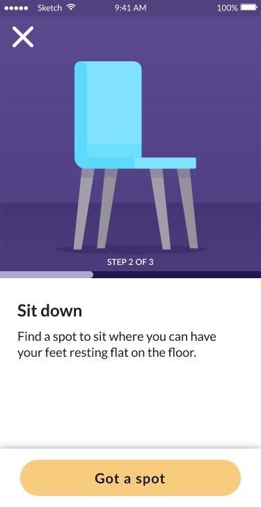
Sit down
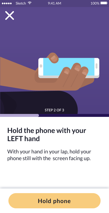
Hold phone
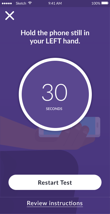
Test in progress (30s)
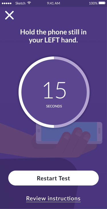
Test progress (15s)
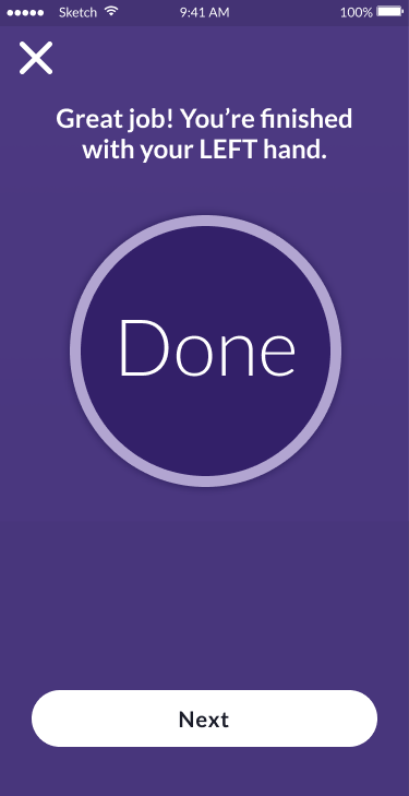
Test complete
- Gait and balance (e.g., step cadence via motion sensors)
The gait and balance test showcases another modular approach: clear setup instructions, audio guidance preparation, and seamless phone-based motion tracking that captures walking patterns for clinical analysis.

Test introduction

Walking instructions

Volume setup
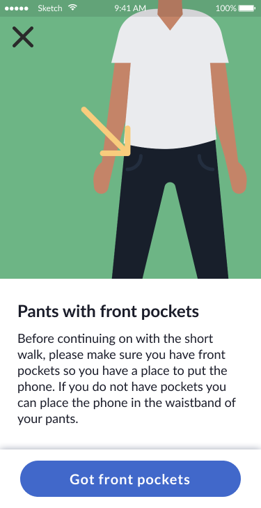
Pants with pockets

Phone placement
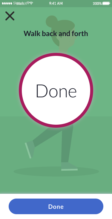
Test complete
🧱Design System Foundations
To ensure long-term reusability and inclusivity, I built a modular design system that later expanded to include assessment modules—such as a VO₂ max test via a chair-stand task and passive heart-rate variability monitoring through wearables—alongside cognitive activities and self-report surveys. I also embedded accessibility-first patterns, including high-contrast support, motion-sensitivity defaults, and voice narration hooks. The design system's core attributes included:
- Cross-Platform UI Component Library
I developed a single, cohesive set of UI elements—buttons, forms, navigation patterns, and feedback indicators—that adapt seamlessly across mobile apps, watch faces, and voice-input interfaces, ensuring consistency and accelerating cross-platform development.

Small sample of Research Kit's Design System
- Brandable UI Themes & Adaptive, Inclusive Illustrations
A unified theming framework and illustration library that lets clinical research organizations and pharmaceutical sponsors apply their own branding to the UI—and easily re-skin illustrations to represent diverse age groups, races, and abilities.

Ex. of theming and replacing illustrations by age and gender.
📱Mobile, Wearables & Hands-Free Optimization
I tailored layouts, touch targets, and interaction patterns to deliver a seamless experience across smartphones, smartwatches, and voice-driven, hands-free interfaces.
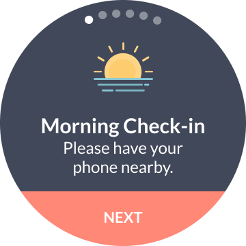
Morning check-in
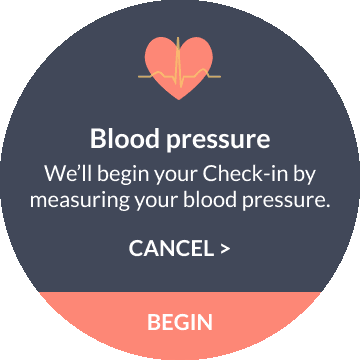
BP measurement
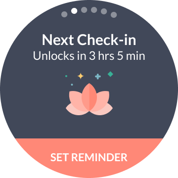
Check-in reminder
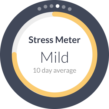
Stress tracking
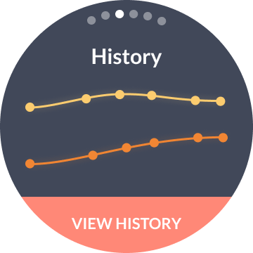
Data history
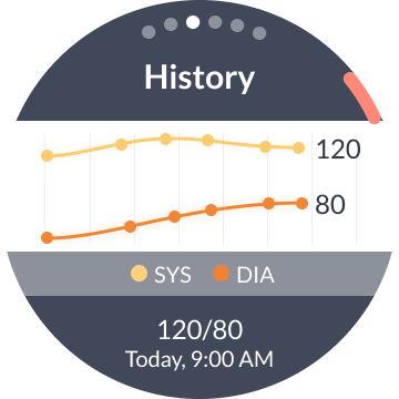
Detailed metrics
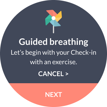
Guided breathing
Outcomes
The redesign improved participant trust, reduced friction, and scaled across studies:
7× increase in study completion
Consent drop-off reduced from 41% → 15%
Retention improved from 5% to sustained engagement across studies
3+ studies adopted the new design system
Strategic Impact
The modular design system accelerated research launches, broadened access, and shifted how clinical products are designed and deployed:
Multi-Study Foundation
Used in BP Lab, Heart Snapshot, and more—cut design time by 50–70%
Shift in Clinical UX Mindset
Prompted researchers to adopt participant-first, scalable design approaches across digital trials
Inclusive Framework
Theming, accessibility patterns, and demographic-sensitive visuals enabled broader reach across age, ability, and identity
Global Enablement
Adopted into Apple's ResearchKit—enabling worldwide deployment across partner institutions
Recognized for Innovation
- Journey PRO: IXDA Interaction Awards Honorable Mention
- BP Lab: Fast Company "Most Innovative in Health" Honoree
Why It Matters
This work transformed a failed app launch into the foundation of a global research platform. By addressing human needs—burden, clarity, dignity—we not only improved usability, but made science possible again.
Today, these tools power studies around the world, help pharmaceutical companies refine treatments, and drive product innovation in wearables. Because we didn't just fix an app—we fixed the relationship between people and research.